Pages in this section
Introduction
Our logo offers a shorthand into the long-standing purpose of the Academy – pioneering advances in the humanities and social sciences. Our marque is a monogram formed of two letterforms. The ‘B’ is set in the brand serif, lending heritage and prestige. The ‘A’ is set in the sans serif, hinting at progress and continued relevance. By cropping into the letterforms, our marque symbolises our collective commitment to detail and rigour.
Colourways
Our logo can be presented in black, white or stone. The black and stone versions may be used interchangeably on a white background to suit any given application. The stone version may also be presented on a black background.
Clearspace and minimum size
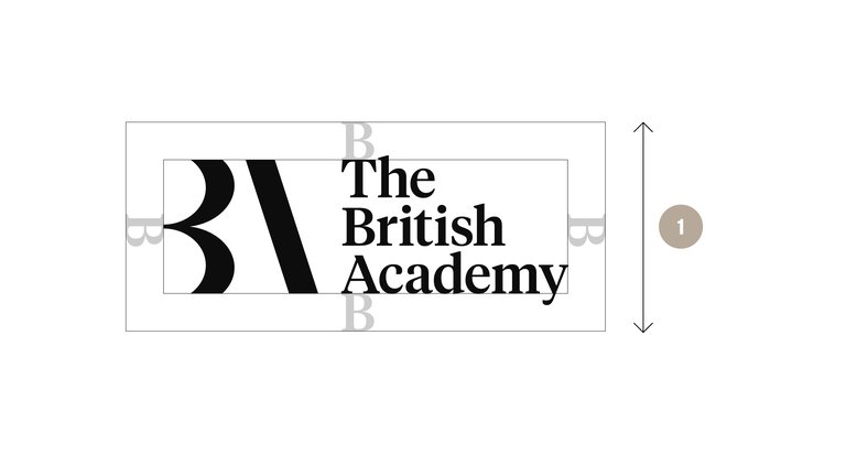
To protect the integrity of our logo, a minimum area of surrounding space is required across all visual communications. The exclusion zone is defined by rotating the ‘B’ letterform around the lockup to ensure a zone relative to the scale of the logo. Our logo should never be presented smaller than the minimum size.
- Minimum size 15mm
Sizing and position
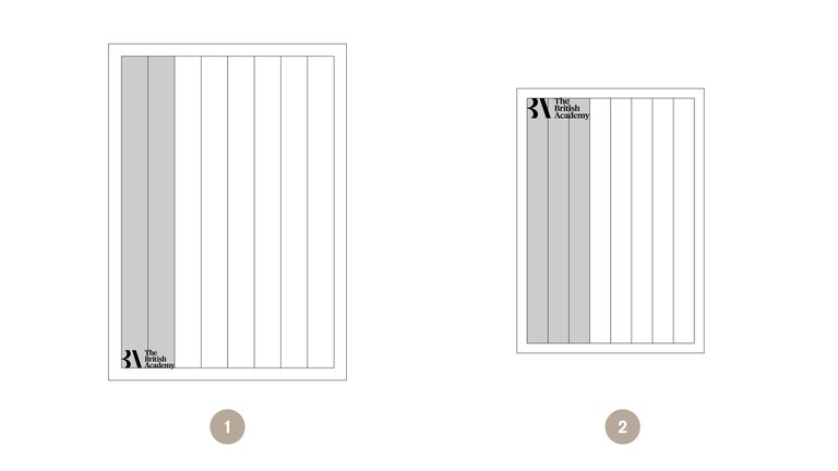
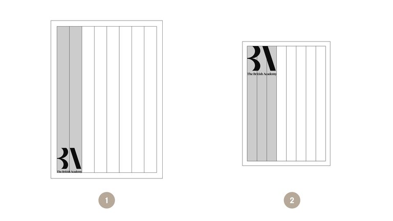
Our logo is always presented on the left-hand side of any given application. The full lock-up can appear at the top or bottom a page.
The size of our logo varies across printed applications, to ensure maximum legibility and appropriate scale.
- A4 (and larger) - 2/8
- A5 (and smaller) - 3/8
What to avoid
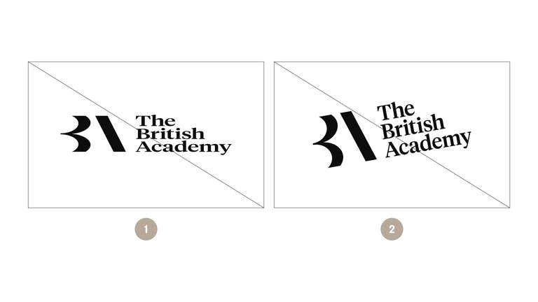
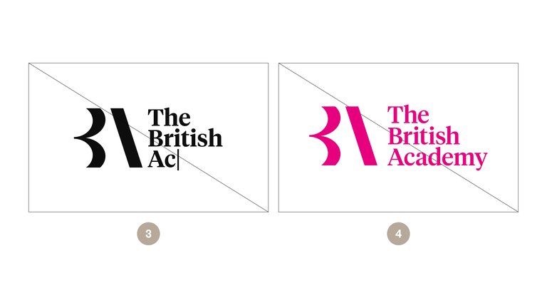
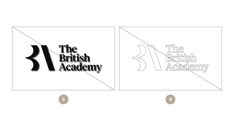
To protect the integrity of our identity, the following rules should always be adhered to when applying our logo.
- The logo should never be stretched, distorted or altered in any way
- The logo should never be rotated in any direction
- The logo should never be manually typeset
- The logo should only appear in colours from the primary colour palette
- The logo should never have a drop shadow or any other graphic effects applied
- Don’t apply an outline to the logo
Co-branding
Primary partners
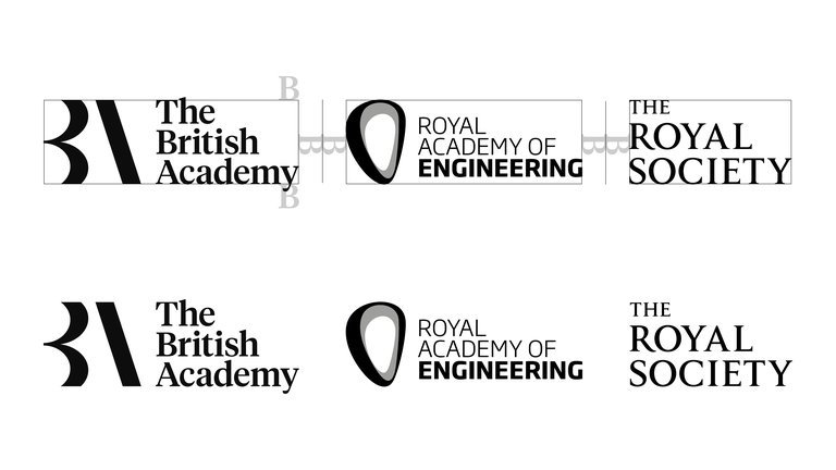
Where we are an equal partner, our logo should be presented side-by-side. The ‘B’ letterform from the wordmark should be used to determine the appropriate position of the adjacent logo. Each logo should be vertically aligned and care should be taken to scale both assets to ensure equal prominence.
Supported by
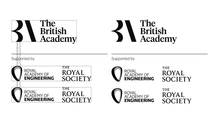
Where we are the lead partner on a project, all subsidiary logos should be situated below, following the clearance guidelines outlined here. Subsidiary logos should be optically adjusted to be 50% smaller than our logo.
Secondary logo
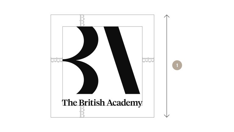
Across larger applications, our alternative logo may be used to create impact and support the recognition of our marque. This logo should be reserved for large-scale marketing applications seeking to capture the interest of our audiences. This may include public facing billboards and pull up banners. This logo should only ever be used on documents above A2 in size.
- Minimum size 65mm
Sizing and position
Across larger applications, our alternative logo may be used to create impact and promote recognition of our marque. This logo should be reserved for large-scale marketing applications seeking to capture the interest of public audiences. Our secondary logo should only ever be used on documents above A2 in size.
- A2 (and larger) - 2/8
Monogram
Detached wordmark
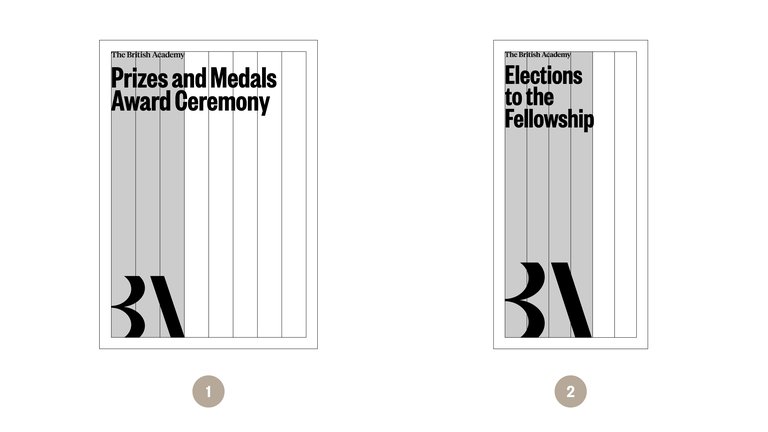
For specific events hosted by the British Academy it is possible to detach our wordmark from the monogram and present our name locked up to the event title. The monogram is then used in isolation at a larger scale.
- A4 (and larger) – 3/8
- Oversize DL – 4/6
British Academy as text
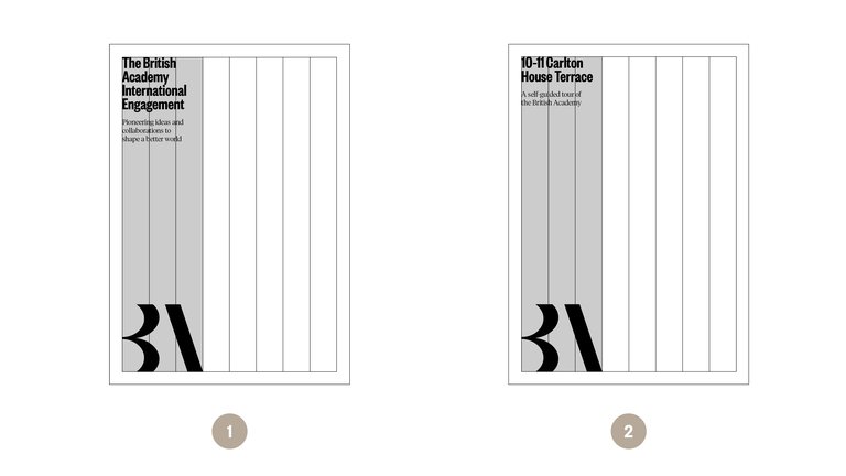
When the British Academy appears as written text as part of a title or masthead then we use our monogram in isolation to avoid repetition.
- Example – International Engagement
- Example – Open House Tour Guide
Monogram only
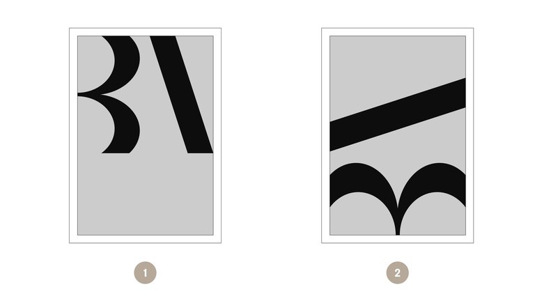
Our monogram works best on its own when used at scale or as a decorative device over the top of images or a colour background.
Monogram only – positioning
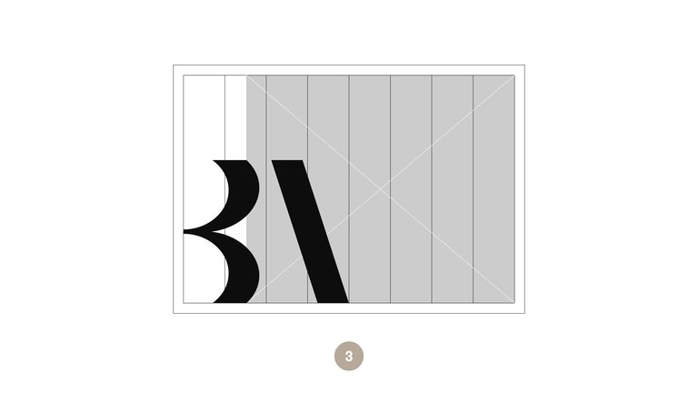
Our monogram can be used full width straight on or rotated 90º. It must be placed at either the top or bottom of the page and should never float in the centre.
- Full width
- Full width
- Logo can overlap with photos
Monogram only - book spines
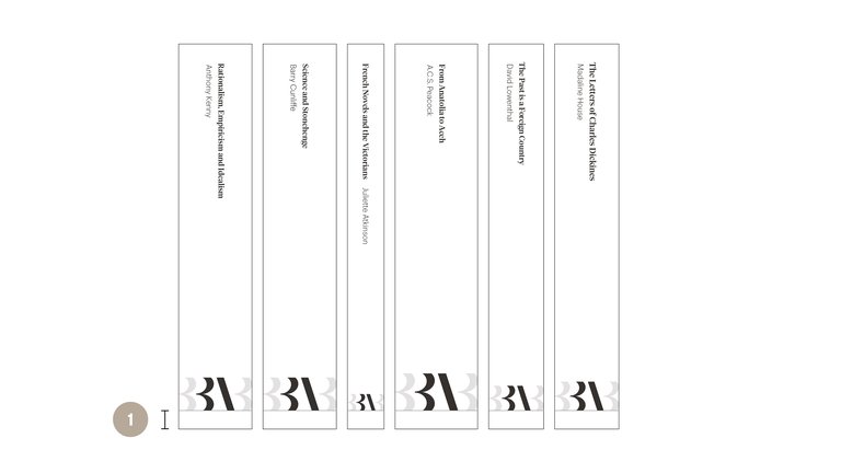
The monogram is used on book spines as our identifier, it must be positioned at the bottom of the margins. It is scaled by using a single B either size of the monogram at the full width of the spine.
- Spine logo margin 10mm
Digital use
Our monogram can be used across social media for the avatar. It must be placed in a black fill with a stone or white monogram inside.
- 1/2 BA
